Infographic Data

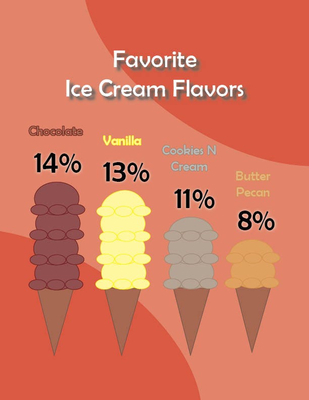
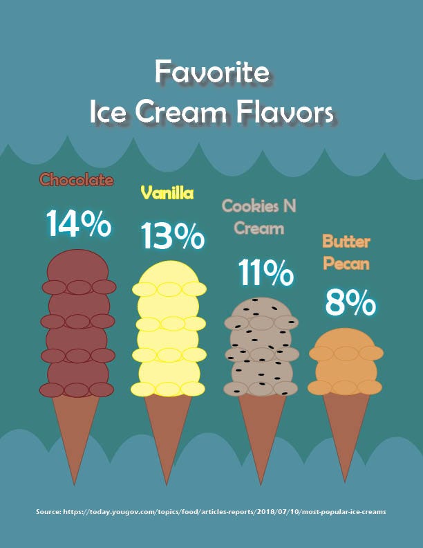
For my Infographic data assignment, I chose to do the 4 most popular ice cream flavors. I use the size of the ice cream almost as the bar chart to show the caparison between the different flavors and their percentages. I also created the ice cream and the cones all through InDesign shapes, while using the stroke feature to add some depth.

For the revision of this assignment I spent a lot of time on the color. The background got changed to a soothing blue with a lighter blue wavy to contrast it on both on the top and bottom. Because of the background color change, I changed the text of the percentages to white and added a blue outer glow. I also added little black circles within the “Cookies N Cream” ice cream to look more like that ice cream flavor. And of course I added the source at the bottom.
